Spotting Shadowless Pokémon Cards: A Guide for Collectors
September 16, 2025
For any Pokémon card collector, delving into the expansive lore of card variants can be akin to a deep dive into the depths of a magikarp pond—potentially overwhelming, yet incredibly rewarding for those willing to explore. Ask any seasoned collector about the Base Set, and they’ll likely wax poetic about the subtle, yet crucial differences between First Edition, Shadowless, and Unlimited cards. These variations, however minute, offer a tangible link to the past, helping collectors piece together the intricate history of one of the world’s most beloved collectible games.
Our story begins in 1999, when Pokémon cards first splashed onto the North American market, carrying with them a hurricane of excitement. Among these were the now-iconic First Edition cards, marked with a black stamp. Each First Edition card from this Base Set design retained what collectors call the “shadowless” look—a stark design choice that, to the untrained eye, might seem insignificant, yet offers a prime example of the devil being in the details.
Following the First Edition release were the Shadowless cards. These cards retained the same design aesthetic—minus the tell-tale black First Edition stamp. Then came the flood, or more aptly, the Unlimited print run. These cards introduced a small, but noticeable design change: an introduction of a soft gray shadow to the right of the Pokémon’s art window. With a slight 3D effect conferred by this shadow, these cards were dubbed “Shadowed” due to this distinct stylistic choice.
This simple design shift not only altered the card’s appearance but also hinted at the timeline and the rarity of its prints. It’s the subtle nuances and the subsequent rarity that have caused prices of Shadowless cards to climb higher than their Unlimited counterparts—especially for those featuring iconic Pokémon such as Charizard, Blastoise, and Venusaur.
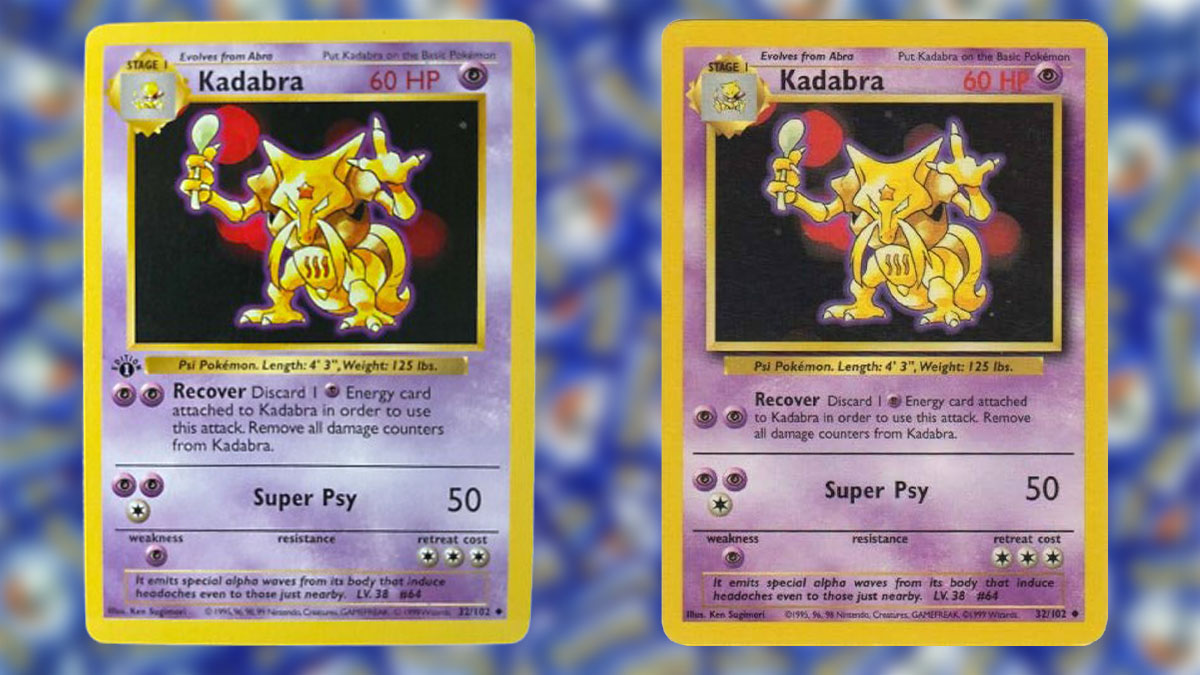
Now, for the practical part: how can one spot these elusive Shadowless cards without holding a magnifying glass and looking like Professor Oak on a caffeine high? The first bit of magic lies in the picture frame around the Pokémon. Shadowless cards feature a flat frame devoid of a gray bar on the right edge of the art window, whereas Shadowed cards boast that softly-ensconced shadow, giving the image a lifted feel, much like sipping a fine Bordeaux gives the soul a lift.
Take a gander at the HP (hit points) and font. On Shadowless cards, the red “HP” text and number are comparatively thinner and more tightly knit—a tight little family reunion if you will. In contrast, Shadowed Unlimited cards showcase the bolder, slightly more spaced-out reunion of “HP,” giving a distinct visual weight to the numbers.
A slight edge in detective work comes with examining the border tone and ink. Shadowless prints often display a slightly lighter yellow border in contrast to Unlimited cards, which might look a smidgen richer—enough to pique curiosity but not hit you over the head with it.
The fonts in the evolution box and attack text provide another clue. Shadowless cards typically exhibit finer, thinner text and lines, whereas Unlimited cards revel in the glory of more robust, heavier typeface. These visual leg-ups provide collectors with clues necessary to determine card authenticity and rarity.
And then there’s the copyright line. Shadowless cards commonly sport a compact multi-year Nintendo, Creatures, GAMEFREAK line, a little piece of nostalgia that Unlimited versions stretch out, tweaking the spacing much like one might adjust their seating arrangement at a Thanksgiving dinner to maintain peace across the turkey.
Holographic (holo) cards shine, quite literally, with yet another variation. Shadowless foils sometimes show an understated sheen and slightly different print texture compared to Unlimited holo versions. The surface patterns and colors might appear flatter—a subtlety that, once you’re aware, becomes unmistakably clear, particularly when you hold both versions in your hand.
Sealed packs and boxes, another layer to this intricate tale of cardboard, carried these variations and were subject to distribution and circulation differences. The Shadowless cards were encased in early Base Set boxes and packs, shelved for a succinct period compared to their Unlimited cousins who flooded the market with unabated enthusiasm.
Practical examples? Shall we? Consider Charizard. The First Edition Charizard, while inherently Shadowless due to its stamp, has a twin—the non-stamped Shadowless Charizard who looks strikingly similar sans the stamp. It’s this twin whose scarcity makes it more valued than the familiar Unlimited shadowed Charizard that graced the hands of countless trainers.
Let’s not forget Machamp. The oddity here lies in the 2-Player Starter Set, which included a 1st Edition Machamp designed in the shadowless style, creating initial speculation, now a learning tool for those training their eyes to detect the differences between these two layouts swiftly.
For cards like Trainers and Energy as well, the shadowless tell is the persistent ghost, an ethereal presence flitting across frames without a tangible background shadow. As your buddy binder fills and your sorting fingers twitch with recognition, these differences become a collectors’ badge of honor—small insights to shared history built across playgrounds, bedrooms, and convention floors.
So, should you stumble upon your childhood collection, unearth those hidden teddy drunk’s, or revisit your stash in search of those precious Charizard cards (lest we forget the grand posterity and paycheck potential they carry), take solace in those minute tells—a window into the past, fluttering like Abra retreating into its dreams. These cards are more than just collectibles; they are time machines, ready to transport you back to a simpler world of ‘90s nostalgia and stay up ’til the late afternoon just to catch ‘em all.